Baseball, Apple Pie, and Web Frameworks
I like baseball better than football (the American version). Football is a game of inches – but it’s measured in yards. Imprecise scope is built into the system. Baseball, on the other hand, is a game of wildly random occurrences that are often measured to the third decimal place. An entire framework exists to understand the smallest, yet important, details of the game.
What I like about baseball is what I like about the current state of web applications. There is a growing set of frameworks that allow you to “scratch your own itch” and be precise about your scope in ways that you never could before. I really like going to web conferences, and seeing things like Drupal being used as a backend to serve content to some other front-end framework (enter your favorite: Angular, React, Ember) that can bend, shape, and re-present that content in ways that Drupal never imagined.
And as a web development agency that focuses on complex content management, that has huge – and really exciting – implications for how we do business.
What’s a Major Corporation To Do?
Take for example a conversation that started with someone that does training and assessment at a Fortune 50 corporation – one that trains a lot of employees. At some point she asked me “Do you guys do inbox simulations?” I had to think for a second if I even knew what inbox simulation was - and it turns out, it’s exactly what it sounds like: a simulated email inbox to test and assess an employee’s response and prioritization skills.
My first response was “No,” and my second – almost immediate – followup was, “but I don’t see why we couldn’t.”
The problem they had was that none of the software they had tried was giving them precisely what they needed. And that’s not surprising. There are more than 500 Learning Management Systems on the market, each with it’s own bloated feature set trying to solve specific use cases with general tools. It’s also not surprising that fewer than 25% of corporate LMS users are “very satisfied” with their system. Given the large features sets and the likely time it took to get them to market, most of them are probably built on technology that’s already five years old.
Enter Proof of Concept
That conversation led to a “show us what you can do” meeting. This was a problem because, well, we had never done it before. My five-or-six-years-ago brain said to myself, “We can’t possibly create a demo of an inbox simulation – I’ll just put together a slide deck that explains what I’m talking about here with web frameworks.”
That’s when Amitai said, “Let’s create an inbox simulation for your meeting – we can do it in Elm. Open a repo and I’ll show you how. What should it have?”
I answered (dubiously), “Well, it should look and feel like an Outlook inbox, and we should be able to demonstrate that their training logic can be applied to simple email tasks.”
“You mean like if you respond one way, you get a certain response back.”
“Yeah, something like that.”
The Scaffolding of an Inbox
So I opened a repository for the project, which at Gizra starts with a stack that includes a location to create static prototype pages served by Jekyll and is automatically updated and published by Gulp. The Semantic UI CSS framework is included so that we get all the goodies that come with it and don’t need to recreate the wheel on design elements (we recently switched from Bootstrap, and I already like it a lot better, if not just because our prototypes don’t look like every Bootstrap website ever).
In a perfect world, I wanted three things:
- An inbox that looked realistic.
- A dashboard that reflected activity in the inbox.
- An admin screen that allowed manipulation of the inbox content.
I started with the admin screen, because that seemed the least daunting.
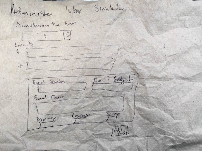
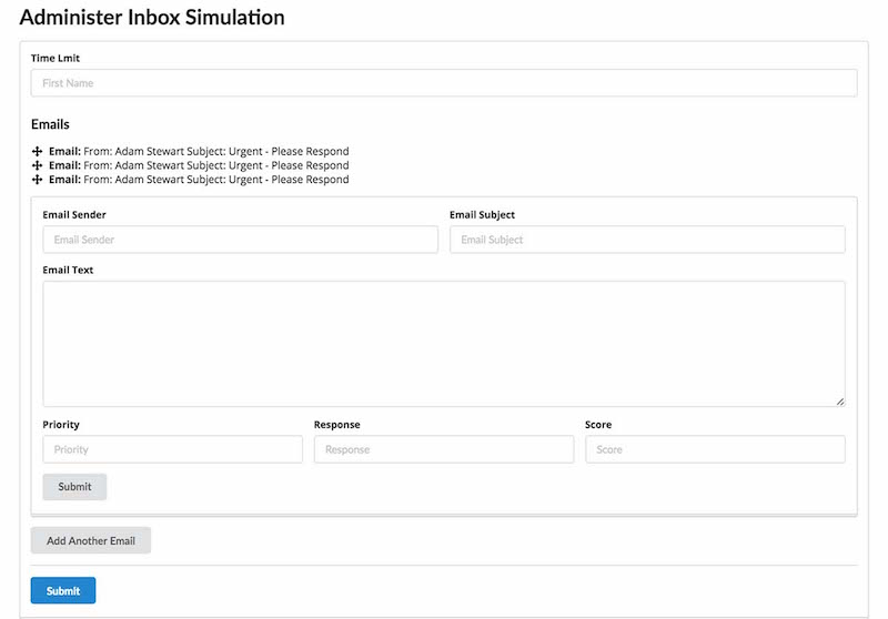
Once I had the idea, I moved quickly into the static prototype, because my CSS skills dramatically outweigh my drawing skills.
The next step was the inbox itself, and because I wanted it to look like Outlook, we figured we could try to grab the HTML, CSS and JS from an Outlook Online account that I had created for this purpose.
What a ridiculous mess that was.
Thirty minutes into that task, I realized it would be easier to recreate the inbox from scratch. Semantic UI made it pretty easy.The Font Awesome icons already there, and the fact that it’s flexbox friendly, meant that I had a pretty good static version up in about 4 hours (it could have been faster, but it was my first time really using Semantic UI, and I was trying to follow strict BEM principles, which we also recently started at Gizra).
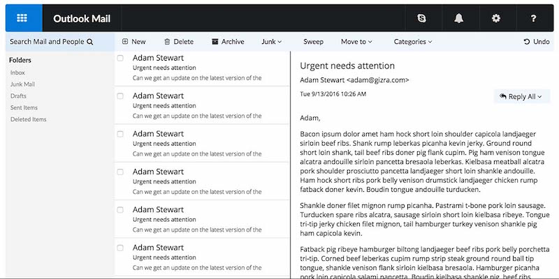
And with that, I made a pull request, and went to bed.
Making it dynamic with Elm
The next day, some strange miracle had occurred.
Amitai had created a basic Elm app, converted my HTML markup to Elm, and created a basic model for a functioning app. I had heard Amitai speak and have read about how Elm’s compiler, which catches runtime errors, makes development so much faster, but seeing it in action was pretty amazing. Our conversation on Github:
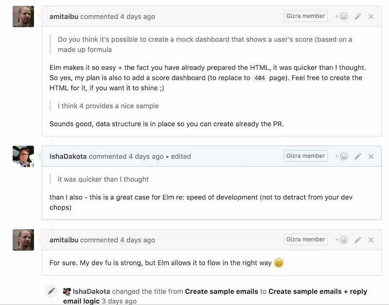
Creating that dashboard referenced in the conversation was fairly easy too. Semantic UI has a lot of nice looking tables and classes to vary the look enough to get a lot of different options. I found one I liked, filled it with enough dummy data to give it the feel of a real dashboard, and we were all set.
In the meantime, Amitai created a nifty little delayed response function. If you choose a particular response (in this case, some version of “ignore”), you get a followup email demanding your attention.
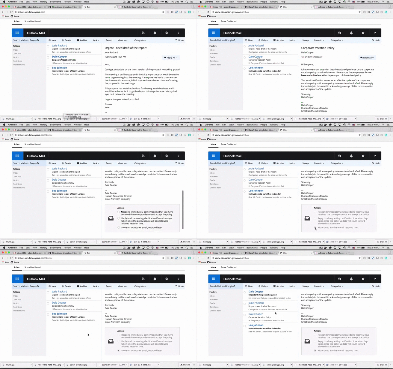
We spent the next day or two refining features, polishing the layout, and replacing the dummy text.
Of course, I needed to add a few tweaks to the layout, and add sample emails that were more realistic, and some logic that made sense. To do that I had to get into Elm and figure out how it works - in particular how to make it present the HTML syntax I needed. It turns out that was pretty logical and straightforward. I’ve barely scratched the surface, but I’m pretty pleased to have my first few commits on an Elm project.
The Result
You can look at the Github repository and try out the sample application, but the final product is a simple response to a complex need. We got there in several days by breaking down a complex problem into small surmountable tasks - a method we call The Gizra Way. In this case, we ignored all other features, even how to permanently store the data – just a simple single page application that shows a realistic inbox with a few features. I never got my admin screen - there wasn’t enough time, and there’s other stuff to do.
We are, of course, helped enormously by a robust set of web frameworks that are helping us do web tasks, faster, with greater flexibility, and with a preciseness like never before.