If you are not familiar with the concept of 960 grid system you should be. In one sentence, 960 is a CSS framework that divides a page to 12 or 16 columns with a total of 960 pixels.
960 is a framework. As so, it doesn’t only give us tools, it also encourages us to use them the _right way. I think it’s a bit like forms API in Drupal that helps us build our forms correctly. In 960 you have CSS classes that can be used to set elements width and position.
For example, working with 16 columns and the following pseudo-code:
<div class="grid-4">
  print $left-sidebar
</div>
<div class="grid-12">
  print $main-content
</div>
Will give us something like this:
The left sidebar is taking 4 columns, and the main is taking a total of 12. As you see in the above example we make sure to “fill up columns”, so even if wanted the main to be in 11 columns, we would add a suffix (e.g. _suffix-1) or a prefix - so the total of the line will be 16 columns. This will assure all elements are in place, and nothing pops up. Oh, and it’s cross browser compatible. Oh, and it’s already RTLed.
Before we start with the examples set up your system:
- Download zen and zen_ninesixty themes
- Download the gizra_ninesixty theme used for this tutorial here (A clean gizra_ninesixty can be found in github)
- Enable the above themes and make gizra_ninesixty the default
- In the gizra_ninesixty configuration page, enable the "Active 960 grid system image"
- Download the example module with the tutorial's Views and Panels, and enable it
- In all the examples I assume we are working with 16 columns grid, and that we have blocks on the left sidebar, but not on the right (so the main content area is 12 columns wide)
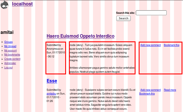
Our first example will be showing in a node view the submitted by and tags on the left, and the node links on it’s right.

Open _node.tpl.php in gizra_ninesixty and compare it to the one in zen_ninesixty. You will notice we added grid-* classes. For example <div class="meta"> was replaced with <div class="meta grid-2 alpha">.
We use 960’s _alpha and _omega. Since we are nesting the elements inside an existing grid-12 (the main content area), we want to make sure the first and last elements are aligned with the parent element (just remove the alpha and omega to visually see the difference).
We also gave the title class a grid-12 to make sure everything is aligned properly. Try removing the grid-12 definition and check your frontpage, to see why it is needed.
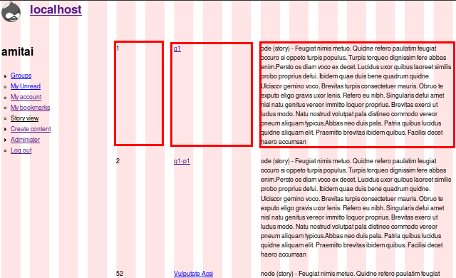
Next example will be using 960 with Views themes. Say you need to show a table with three columns with different width for every table column. You can use the ‘table’ style, and CSS the td CSS element, but I find it even easier with 960. Add a few story nodes, and click on the _Views 960 menu item to see our Views page in action.

Let’s see what we have done here: The view shows three fields of published story content types - node ID, node title and body. Using Views’ theme suggestions we decided to override the row theme by placing _views-view-fields–story-simple-view–page.tpl.php in the gizra_ninesixty theme directory. This allows us to add our grid definitions. You might notice that the style of the view is unformatted list. Web-semantically speaking it might have been better to choose another style, but for simplicity sake we used it. In the top of the file we added the following code:
<?php
  // Set the grid of each column. We can key the array with nid, title, body,
  // but by using numeric keys, we allow changing the fields in the Views without
  // harming the theme override.
  $ids = array(
    '0' => 'grid-2 alpha',
    '1' => 'grid-6',
    '2' => 'grid-4 omega',
  );
  // Get the ID keys.
  $ids_keys = array_flip(array_keys($fields));
?>
and in the same file we print $ids[$ids_keys[$id]]; before each field in the row - like this, each field gets the 960’s classes we want, and we get the “table” effect, without tables.
Our last example is creating a new Panels layout (You already know how much we love Panels).

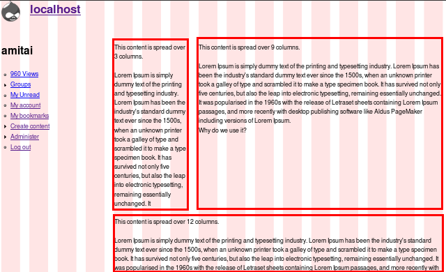
I will not cover every step, but point you to the important concept. In _gizra_ninesixty/layouts/basic/basic.inc we removed the CSS included file as the positioning is managed by 960. in basic.page.tpl.php we simply added the grid definitions we know from previous examples. As easy as that. Click on _Panels 960 menu item to see it in action.
Here are a few tips on how you would know you are thinking - and acting - the 960 way:
- You hardly/ never use ```float```, ```margin-left/ right``` and ```width``` to position elements
- Your css-rtl file is tiny or non existent, as 960 is taking a good care in your RTL
- When you define elements one the same line, you make sure it fills all 16 columns, by adding prefix or suffix
- When you hover over the elements the red border that shows the grid size appears correctly, and without an offset - if it does, this is a good sign that some definition is wrong. Track back the error and fix it before you continue
- We patch zen_ninesixty with this patch to fix the RTL support.